
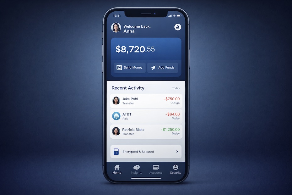
Fintech user experience design increases conversion by simplifying decisions, signaling trust early, and guiding users through financial actions with clarity and speed. When applied with discipline, these UX principles regularly produce conversion lifts approaching 300% across onboarding, payments, and core money flows.
This article breaks down twelve execution-level UX principles used by high-performing fintech platforms to turn intent into action. You will see how real user behavior, verified UX research, and performance metrics shape interfaces that convert under financial pressure.
Step 1: Strip cognitive load from every screen
Cognitive load rises fast in financial products because users process numbers, risk, and compliance at once.
Research from Nielsen Norman Group shows that task success drops sharply when users face multiple decisions on a single screen. High-conversion fintech apps enforce single-focus layouts where each step answers one question only. This reduces hesitation and shortens time-to-action.
When you audit screens for necessity, conversion responds immediately. Removing redundant copy, secondary buttons, and decorative elements lowers abandonment in onboarding and payment flows. Users move forward when nothing competes for attention.
Step 2: Surface trust signals before asking for commitment
Trust must be visible before requesting sensitive data, identity checks, or payment approval.
Studies summarized by Baymard Institute show that visible security cues raise form completion in high-risk flows. Encryption indicators, regulated-partner disclosures, and plain explanations of data usage reduce fear at the moment of decision.
High-performing fintech products place reassurance early. When trust signals appear only after friction, users pause or abandon. Showing safety first keeps momentum intact.
Step 3: Compress onboarding to the first value moment
Onboarding converts when speed outweighs completeness.
Data analyzed by McKinsey shows that every additional required field reduces completion probability. Leading fintech apps capture only what is essential to deliver first value, then defer deeper verification.
Momentum matters. Users who reach a quick success state return, verify, and fund accounts at higher rates. Conversion accelerates when onboarding respects time and attention.
Step 4: Apply progressive disclosure to complex information
Progressive disclosure manages complexity without hiding important detail.
Financial products demand explanation, yet dumping information upfront suppresses action. High-conversion investment and lending apps reveal detail only when relevance peaks, using expandable sections and contextual prompts.
This pattern supports informed choice while protecting flow. Users feel guided rather than overwhelmed, which sustains progress through regulated steps.
Step 5: Make the primary action unmistakable
Primary actions must dominate visually and semantically.
Payment confirmation, loan acceptance, and investment execution should never compete with secondary options. Button contrast, spacing, and language determine whether users advance or hesitate. Ambiguity creates delay.
Teams that enforce one dominant action per screen reduce decision time and raise completion rates. Clarity here directly translates into revenue events.
Step 6: Deliver immediate feedback for every interaction
Feedback reassures users that financial actions were received and processed.
Transfers, payments, and submissions require instant acknowledgment. Without feedback, users repeat actions, doubt outcomes, or abandon. Loading states, progress indicators, and success messages maintain orientation.
Platforms that implement continuous feedback loops see fewer errors and higher trust scores. Confidence grows when systems respond clearly.
Step 7: Replace internal language with user intent language
Language clarity directly influences conversion in fintech environments.
Internal terminology confuses users during critical moments. High-performing apps replace operational phrasing with goal-based language that mirrors what users want to accomplish. Transaction summaries, alerts, and prompts describe outcomes, not systems.
Community feedback across fintech forums consistently flags wording as a friction source. Clear language reduces hesitation and support reliance.
Step 8: Personalize flows using behavioral signals
Personalization increases relevance without demanding effort.
Fintech platforms use behavioral data to reorder dashboards, highlight likely actions, and suppress noise. According to performance data shared by Stripe, tailored payment experiences improve checkout completion across financial products.
Subtle adaptation works best. Users respond positively when interfaces anticipate needs without asking for configuration.
Step 9: Treat errors as recovery paths, not dead ends
Errors are unavoidable. Recovery design determines conversion impact.
Clear explanations, preserved progress, and suggested fixes prevent abandonment. Error messages that assign blame or offer no direction increase churn. Recovery-focused design keeps users moving.
High-conversion fintech apps design error states with the same care as success states. This protects funnels under real-world conditions.
Step 10: Reinforce progress and completion milestones
Progress indicators increase completion in multi-step financial tasks.
Account setup, lending applications, and compliance checks benefit from visible progress. Users commit more readily when they understand remaining effort. Behavioral research referenced by Harvard Business Review supports this effect across goal-driven tasks.
Progress visibility reduces perceived effort and increases follow-through across long flows.
Step 11: Design mobile-first for real financial behavior
Most fintech interactions now occur on mobile devices in short sessions.
Mobile-first UX prioritizes thumb reach, readable typography, and minimal input friction. Desktop-first designs adapted to mobile underperform consistently. Conversion improves when flows are rebuilt specifically for small screens.
Mobile optimization affects activation, funding, and repeat usage across consumer fintech products.
Step 12: Measure UX success using conversion-linked metrics
UX decisions must tie directly to business outcomes.
High-performing fintech teams track task completion, time-to-value, error recovery rates, and repeat actions. Vanity metrics dilute focus. Conversion-linked measurement aligns design effort with revenue impact.
When UX teams operate with performance accountability, improvements compound quarter after quarter.
Fintech UX principles that boost conversion
- Reduce cognitive load
- Show trust before action
- Speed up onboarding
- Clarify primary actions
- Personalize key flows
Turn UX discipline into revenue momentum
Fintech conversion growth comes from execution discipline, not visual polish alone. When UX principles align with real financial behavior, users act with confidence and speed. Each principle compounds the next, strengthening trust and momentum across the product. Platforms that measure, refine, and operationalize UX consistently outperform on activation, retention, and revenue. If conversion matters, UX must operate as a profit engine.